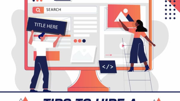
So, you have your own E-commerce website. Well, congratulations, you have taken the first step to a larger digital footprint to get you and your brand noticed.
You have curated content that you believe will tell people about your brand, services and other core facts about your business and its products. You have photos, videos and even images at different angles showcasing your products or services. You may even have a personal website with your professional portfolio and other side projects.
The only problem is: you don’t have many visitors to your website and the visitors you have are not interested in buying your products or services.
Your sales are at a standstill, and your brand awareness isn’t where you want it to be. You have so much to say, yet no one is reading your blog posts or what your company stands for.
So, the questions are – How do you increase visitors and how do you increase your conversion rate and get a solid Return on Investment (ROI) on your website? You can get more ROI by paying attention to some essential psychological design tips tailored to your audience and created by your audience’s desires and needs.
Here are six design tips you can incorporate into your website to increase your conversion rate:
1. Organizing Your Content
No one wants to visit a website that is difficult to navigate. Streamline your information based on the Law of Pithiness of German Gestalt psychology. This psychological law and mindset are based on the preference of humans to view things in a simple way —a more symmetrical way of viewing and thinking.
In other words, we want to be able to know what we are reading. We want concise, straight to the point — yet thorough — website content and design. We don’t like being startled with an array of paragraphs, multiple calls to action, busy imagery, etc. You want people to know what you offer, but you don’t want bullet points, line after line of text and other convoluted messaging.
Focus on what you want your customers and potential customers to know. Instead, try having just one call to action on your page, and make sure your website goers see it in a prominent location. In many cases, this is at the top of the page, either in button format or another call-to-action.
If you’re not sure about your strongest call to action, then survey one or several of your target audiences. If you want them to purchase a video game on your site, then let them know exactly how they can do that by including a “Buy Now” button.
If you’re a media content company targeting millennials, then do your qualitative and quantitative research to ensure that you are reaching your target audience. Organize your SEO keywords, prioritizing your internal and external key points from top to bottom, so people will find your website in search engines and other places.
If you’re at a standstill, then ask employees, investors, customers and other demographics to beta test your calls to action, overall simplicity of the website, effectiveness and more. Remember: less is more.
2. Focusing on Cost/Benefit Analysis
If you are wanting to drive sales with your website and its content, then use the Principle of Cost and Benefit Analysis to reach your goal.
You want to give something to your target audiences that will benefit them, such as a free eBook on social media marketing tips, a collection of CrockPot recipes or whatever is important to you and your business.
In return, you may ask him or her to sign up for a monthly eNewsletter so you can pitch new products, receive feedback and send out other messages. In reality, people are busy and want things to be simplified, much like in the first point.
Would a potential customer want to fill out a five-question contact form with their basic contact details (or perhaps just his or her email address) or a 15-page SurveyMonkey survey just to get to their eBook? The former is the best route to take and will help you gain more conversions. Keep your contact form basic.
3. Save Your Customer Time
In addition to measuring the Cost/Benefit Analysis of your home page and its associated pages, make sure you have quick, streamlined processes for the time it takes for your customer to take a specific action on your website. If he or she has to scroll up and down and side to side to find your call to action, contact information or another vital piece of information, he or she may give up. This could cost you sales or conversations to other parts of your website or to your social media accounts.
Use Fitt’s Law to focus on the distance to and the size of your target (or what you want your customer to do).
Does it take a minute for all of this to play out?
If you are lacking the conversation rate you want, you may want to make the process easier in your website design. For example, if you are a self-publisher and are selling your works on Amazon, create a large amazon.com button instead of using a hyperlink tucked into the text of a paragraph that no one reads. If someone sees the button, he or she is more prone to click on it and potentially purchase one of your books. This will increase your click-through-rate (CTR), as well as your overall conversion rate.
4. Add Faces to Your Website
When you see a face on a website, you subconsciously begin to think about the details of that person: what was he or she doing at that exact moment? What does her facial expression mean? Why does he like this product on this website? We think things, and many times, we don’t even realize we are thinking them.
Using your customer’s thought processes to your benefit. When a website goes is intrigued by a photograph, he or she will likely do some more exploration on your website. He will click the “Shop Now” tab or she will watch the tutorial video on how to create her own makeup looks.
Faces are more appealing to customers, according to research. If you use photographs and use them well, you can even use the photography to direct your customer’s eye to your call of action or another part of your website to increase your conversions for a particular action or web page.
For example, if you have a photo of a female model look upward, then the person viewing your website will naturally look up the page to see what the woman is looking at. In this case, it could be about the latest trends in handbags.
If you run a local nonprofit, then add photos of people who benefit from your organization’s services or of a volunteer at a fundraising event. If you’re selling the hottest new shade of lipstick, show the color on models with various skin tones. Get in the trenches and show your customers the human element of your website. Don’t just tell them. SHOW them.
5. Recognize the Customer’s Past Experiences
People come with their own sets of values, opinions, and experiences. While we cannot control how our website actually makes a person feel, we can build on past experiences to help track and increase our website conversions.
Do your research and see what works for other websites in your industry. Don’t be afraid to think outside of your comfort zone. See how your customers feel about your website. Their past experiences with your brand and its website shape their perceptions of you and your brand.
Unless… you can make some changes to make their experiences even better. If you have received a slew of customer complaints about confusing “Add To Cart” icons, spinning circles during credit card transactions or how your return policy isn’t outlined well, then it could be time to make some changes. Make your “Add to Cart” button text only, increase the speed of your check-out process and write out your return policy in a concise fashion.
6. Social Media Pixels and Other Codes
This behind-the-scenes change to your website can help you track conversions to your website and back to your social media accounts.
If you’re running a Facebook or Instagram ad to attempt to get more conversions to your website, then install your Facebook Pixel code in the back-end of your header and footer on your website. This will ensure that you are tracking all of your fans who visit your website, whether it’s a particular product page, a blog post or your homepage. You will be able to easily track conversions and evaluate the success of advertising, social media, and other campaigns.
Conclusion
While these six design conversion tips are not the only methods you can employ to increase your conversions on your existing website, they will aid you on your quest to create a better sense of what your customers want. In addition, they will provide you with whatever your call to action promotes, whether that is increased sales of a new product, awareness of a cause or something else near and dear to your business.
Maunsell Property Consultants offers Commercial property services to buy, sell and lease real estate in Sydney, NSW 2000. Visit us now for more details.rn


