


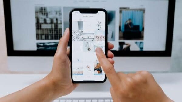
Once upon a time on the information super highway, having a well-designed and easy-to-use website was the perfect solution. This is no longer enough, however, as most internet users are now accessing websites from smart phones rather than from a computer or laptop. It is paramount that you optimize your website for mobile devices. Here are some ways you can do so.
Avoid Flash and Pop-Ups
While today’s smart phones do amazing things, many still don’t do Flash. Others try but simply fail to do it well, which only serves to frustrate users. Pop-up windows, too, can be frustrating and hard to close on a mobile phone. Avoid these elements when designing your website to attract more mobile users. If you don’t, customers will simply surf away from you. If you truly feel your site lacks something important without Flash, use HTML5 to add the element instead.
Design for Fingers, Not Mice
Links and buttons can be fairly small when a website is viewed on a desktop or laptop. The pointer icon that tells users where they will be clicking with their mouse simply doesn’t take up a lot of room. Fingers, however, are much wider and are the tool of choice for those on a smart phone. Make your buttons large enough to select easily with a fingertip. Be careful about link placement as well, as users don’t want to accidentally click a link while scrolling down the page to read your text.
Don’t Be Dedicated
In this case, dedication refers to businesses maintaining two websites: one dedicated to computer users and a second specifically designed for mobile users. This is an option, but there is another way. Instead, consider building a responsive website that is able to cater to both. Many IT professionals prefer this setup, as do Google and Bing. Anything you can do to make search engines happy is wise, as it may increase your ranking. Web developers and Ottawa IT services professionals can also help you with this if you’re unsure how to design your website this way. This is often too complicated and time-consuming to do on your own.
Add Click-To-Call
While mobile sites can challenge you to do more with less, cell phones offer an advantage that computers don’t. Potential customers can call you right from their mobile phone if they have questions or like what they see on your mobile site. Take advantage of this by adding a click-to-call button that lets them call your business with the touch of a single button.
In yesterday’s market, you couldn’t afford to be without a website. In today’s market, you need to make sure that website works for both computer and mobile phone users. Whether you tackle the job on your own or outsource the task, it’s a job you should tend to as soon as you can.