


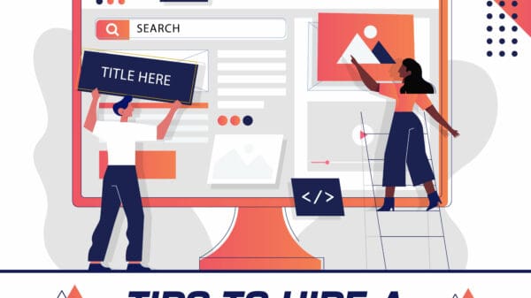


Web sites make use of forms to convert incoming traffic into subscribers, clients, and leads. The idea is to engage the visitor into filling the correct information in those forms. As simple this may sound, it’s actually a hard task to convince the visitor to spare some time and fill your form. However, it is very crucial for websites to have a high conversion rate, especially if it’s an online lead generation one. Here are some of our expert tips on how to optimize your website’s conversion rate.
Here are some of our expert tips on how to optimise your website’s conversion rate.
Necessary fields only
Time is limited. This is a common phrase that all web developers should take into consideration. Website visitors wouldn’t wish to spend most of their time filling a form. It should be as brief and concise as possible. Put as few fields to collect the most relevant information that you require. Otherwise, you’ll bore the visitor halfway to completion.
Existing evidence indicates that reducing the number of fields and consequently the length of the form, increases conversion rates. Asking too many questions is so tiring and no one likes being subjected to such torture. It is paramount that the developers consider the visitor when developing these forms. Only ask for information you can’t access from any other site or location. If you must have a lengthy form, be as creative as possible to keep the visitor hooked onto the site. Similarly, use multi-step forms to break down the whole thing. Here are more tips to handle the lengthy forms.
Mobile users?
A report by Davey shows that the number of mobile users exceeded the number of desktop users in the year 2014. These statistics should help web designers to come up with sites designed for mobile use. Bearing this in mind, forms should also be compatible with most mobile phones.
Avoid redundancy
In as much as I hate filling forms, I mostly hate repeating the same process over and over again. I hate answering the same question twice. Personally, I wouldn’t continue filling a form with repeated questions. Its high time developers adopted some smart or intelligent web forms. What these forms do is that they hide the answered questions so that the visitor won’t have to fill them again. I know! Pretty smart!
Reward the visitor
We all love rewards, right? It would encourage the user to fill the user if he/she would benefit in some way. This could be done by sending the visitor some updates, say tech or fashion updates on a weekly basis depending on their likes/dislikes. You could also reward visitors by sending some free recipes, e-book or frequent tips after filling out the form.
Make sure your form is unique
Ensure that your form is unique compared to other forms on other sites. Highlight your text, use large font size, use bright colors, contrast, and blank space to make it stand out. Additionally, use large header images to engage the visitor.
Comfortable with too sensitive information?
Requesting for personal information may push the visitor away. You don’t just go asking for people’s phone number, address, age or state/city. Generally, most people are afraid of sharing such sensitive information on sites they’ve just landed. Security issues are on the rise and of course, privacy protection is critical. This is how to optimize contact forms for better conversion rates.
Use a language that is easily understandable
Since you target various categories of people, you should use simple language with a high level of readability. The titles should be large and clearly communicate to the visitor, the benefits of them participating in the filling of the form.
Give them the freedom of choice
Fields should be open ended and the customer should be allowed to choose whether to fill the required information or not. Mandatory fields reduce the rate of conversion significantly and they should be avoided. Drop down menus, especially those with lots of options or choices discourage the visitors from filling out the forms. Ideally, open-ended forms help do away with this nagging issue.
Use of contest forms
Engaging the visitor in some form of competition encourages them to continue navigating through the site. These offer the best conversion rates according to Formstack’s 2015 Report.
Test, compare
It’s always good to test different forms conversion rate. Use one form for a week or two, then switch to another with a totally different parameter in the fields. Compare between customer reception and conversion rate of each. Test between the two and choose the one to adopt.
Validate visitor details
It wouldn’t hurt to allow for client correction every time they make a mistake. This makes the filling easier and user-friendly. Offer the visitor some help to reduce the chances of collecting inaccurate information. This can be done by use of hints, help text and some automatic validation system.
Test the button copy
“Click here”, “go”, “next” and “continue” are some of the most widely adopted and user-friendly buttons. These may turn things around for you.