


Responsive web design is essential to make sure that the website you build can be viewed on multiple platforms. It is in fact a boon for not only web design in India but just about all places. It is quite common for people to have a mobile phone nowadays; besides which the number of people having smart phones that can browse the internet are increasing as well. In fact, as per recent studies, the growth rate of the mobile phone market is currently higher than that of the personal computer market.
 Image Courtesy: mashable.com
This is not very surprising since every individual tends to have a phone today while the same is not true for a computer. This means that there are more people wanting to surf the internet on their respective mobile devices than ever before. Furthermore, there is one thing all these users have in common, they want to browse the Internet on their mobile devices of various different makes and they want to do it with ease and have the site display properly. Unfortunately, those working on their mobile phones are not as patient as those using a personal computer.
 Image Courtesy: responsivewebdesign.ltd.uk
Hence, if a website doesn’t load or takes too long to load or even if it is hard to navigate or utilize then it will most likely be ditched by the mobile phone user and they will likely seek an alternative.

Image Courtesy: www.responsive-design.com
Responsive web design promises to solve these issues by the web designer being able to maintain one website that suits just about any platform and device.
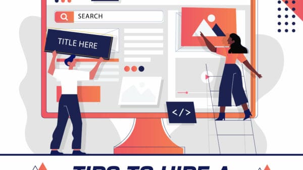
With responsive web design as the viable option, there is now more pressure on web designers to make their designs responsive. This is not always an easy task since responsive web design has its own set of limitations as well as making it difficult to accommodate all design and content requirements into it. The following are therefore some of the tools that are available to make a typical responsive design task a little easier.
- Elements Collages: Creating full mock-ups in Photoshop and declaring how the website will look on different platforms makes very little sense. Super Friendly at http://www.superfriend.ly has taken the style-tile concept one step further with Element Collages (http://rif.superfriend.ly/). Element Collages are comprised of visual explorations for interface component. These collages facilitate conversation around the visual direction without having to create entire comps.
- Pears: Anna Debenham explains the benefits of front-end style guides as allowing for easier testing, and establishing a better workflow, creating a shared vocabulary and serving as a useful reference to keep coming back to. Pears (http://pea.rs) is an open source WordPress theme created by designer Dan Cederholm for creating your own front-end style guide. Pears makes it easy for design teams to contribute to the shared pattern library in order to establish a consistent design system.
- Remote Preview: Adobe Edge Inspect is a paid service that currently rely on apps that work only on iOS and Android devices. There are a whole lot of other mobile platforms out there including Windows Phone, Symbian, BlackBerry and more. Thus, a tool called remote preview was created which is a simple tool that live refreshes your website on a host of devices (https://github.com/viljamis/Remote-Preview).


Bayo
April 21, 2014 at 5:45 am
Makes sense that sites these days are all moving towards creating responsive websites … however, the smartphones these days really need to hopefully move towards a common platform so that way websites can work on all mobile devices! Quite difficult to make sure the sites work on iPhones, androids, and other devices!
Moqtadir Rakib
April 25, 2014 at 12:40 pm
Hello, Sophie.
Really enjoyed reading your post. Keep writing informative and useful post like these one.
😀