


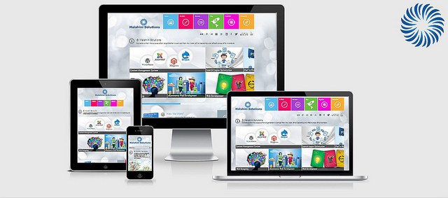
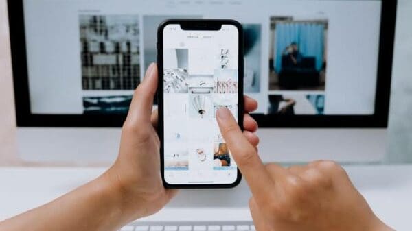
Image via Flickr by Malahini Solutions
If you consider how many phones and tablets are out there today, it’s easy to realize just how many screen sizes, resolutions and operating systems there are in the market. This is why developers have been stuck with thinking about how to get websites and apps to work seamlessly across every platform.
With the thriving mobile and tablet market, businesses and bloggers are trying to get their websites optimized to suit the needs of the mobility-hungry audience. The best way to achieve this is by deciding what content should show up on mobile devices and which ones should be left for desktop users only. The content that does go on the mobile versions of the Website is usually just what people need quickly and not the extra information that can be found on the desktop website.
Below are the three most popular ways to bring websites to the mobile market, followed by a comparison of each method.
· Responsive Websites
Responsive web design is becoming hugely popular because it is the only way to use one set of code across every platform at the same time by simply changing the design based on what platform is being used.
· Mobile Websites
Mobile websites have been around for a while now because they were designed for smaller devices. The only difference between the normal website and the mobile website is that the mobile version is more text-based without the large images that are found on the regular website. Mobile websites get their own web addresses, usually with a small “M” before the regular web address.
· Native Apps
Native mobile apps are applications that are built for every platform. Each one has a different set of coding instructions depending on the platform that it is being used. This means that developers must code their apps multiple times to make sure that every single mobile device will allow it to work on its system.
Comparison(s)
As you can see, these three design standards are different, yet they are trying to do the same job i.e. bring a company’s content to mobile devices. A good way to know which one to use is to understand all of the differences between them.
Responsive vs. Mobile Design
While it may seem that responsive design will always beat mobile design, sometimes that’s just not the case. The fact is that some sites want the quickest way to be able to give their visitors a way to navigate their sites, so mobile design might work better for them. On the other hand, if a company wants to update all of their sites at the same time and do so regularly, responsive design will be better for them. In terms of cost, mobile design is always going to be cheaper because it has far less coding.
Mobile Design vs. Native Apps
Choosing between making an app for your company or designing an easy to use mobile site totally depends on the content that you want your visitors to be able to access on their mobile devices. Native apps will give each user a more personal experience because they can maintain their account on their mobile devices. Mobile design is used when you have a site that is designed to give your visitors quick information.
Responsive Design vs. Native Apps
This is one of the tougher decisions that designers have to make because there are advantages to both designs. Native apps have their own design that are made to work perfectly with mobile devices (with touch features), while responsive design is a fully functional website on a mobile device.
The one huge advantage for native apps is that they can store a user’s information on the mobile device so that they can quickly use the app as they please.
To conclude, the design choice is completely up to the developers and the website owners, but, as you can see, there are advantages to each, depending on the needs of the company. It is up to you to think about how your website should come across on each device so that you know your users will be getting the best experience possible with your content.


himanshu
July 9, 2013 at 5:45 pm
Yeah i agree with you that easy and beautiful user interface attract your readers the most, its up to you what you want your readers to stay a longer time on your site or not.
khaja moin
July 10, 2013 at 1:31 pm
Need for a reponsive as well as mobile site increased. As number of mobile users are increasing day to day with these smartphone’s trend.
If you’re planning to have online business then you must’ve responsive design. And for having a brand identity you need to have an app.
Well developing app depends on your site niche.
BTW excellent post.
@Khajamoin1
Alexandra
July 11, 2013 at 3:17 pm
Many people want mobile apps but think it is too hard to create them. Fortunately now there are quite a lot of useful online services which allow building apps without programming skills and in hours. I am using SnAPPii at the moment and really glad I can feel like a mobile app developer and make apps on my own.
Michael
July 11, 2013 at 4:15 pm
I believe if you can afford to make a responsive site, go for it. If you don\\\’t have the money then a mobile site will work just fine. As long as the viewer has a way of getting to the site via smartphone or tablet, your doing your job. Thanks for the post it was very interesting.
Michael
July 11, 2013 at 4:16 pm
I believe if you can afford to make a responsive site, go for it. If you don’t have the money then a mobile site will work just fine. As long as the viewer has a way of getting to the site via smartphone or tablet, your doing your job. Thanks for the post it was very interesting.
Johanna
July 12, 2013 at 12:42 pm
Thank you for appreciating the post. Found the discussion in the form of comments to be very helpful and I believe the comparisons that I have listed would let you all to make a judicious decision about choosing designs.
Victoria Mudaraya
July 15, 2013 at 11:05 am
Your comparison is really interesting, the only thing I can not agree with is mobile design – i personally hate when not a full site opens on my tablet, that has enogh screen to display all pics, especially in case of e-commerce sites – here responsive would be better I think