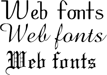
 In the earlier days, web designers hardly gave much thought to the typography that would form part of the website. However, there has been a drastic change in recent times with several web designers showing a keen interest to develop compelling typography. Although a captivating web design and stunning images capture your attention, the correct usage of font can add an attractive touch to the story that you wish to tell. Sometimes, the use of the right font can mean the difference between a good website and a stunning website.
No matter what type of font you choose to use, you must ensure that you consider the following points before making a decision:
1.) The font should be legible:
No matter how creative you decide to go in terms of your font, if people cannot read it, they will find another alternative to getting access to their requirements. Although there is nothing wrong in selecting a creative looking font, it is wise to stick to simple fonts to get maximum positive results. This holds true especially when you need to insert copious amounts of text as content for the website. Therefore, it is wise to limit your creativity to those parts of the text that occupy minimum space on the website like the Title of a post, particular headings and the likes.
Besides, formatting of the font to enhance its legibility is also very important. The size of the font must be just right. Selecting a font size that is too small might have your readers squinting to read the content. Conversely, a very large font size is aesthetically disturbing.
2.) Your font should match the mood of your website:
This can be a deal breaker. You need to select a font style that mirrors the mood of your website. If you thought that compelling images and an attractive design are all it takes to express the mood of a particular website, you must contemplate that again. Usually, a serious website delivering important and serious information must stick with simple fonts while those that are meant for entertainment can use whimsical or cursive fonts.
Font styles, in their most basic forms are available in 5 types – Serif, Sans Serif, fancy, monospace and cursive. Tweaking these fonts slightly gives rise to newer varieties and typography that adds to the bulk of the existing font. As a rule of thumb, you must opt for either Serif or Sans Serif when you wish to select a font that will form a large body of text. To ensure that you can make the right decision, it is important that you understand the difference between the two.
1.) Serif:
Every letter in Serif is given a distinct look with the help of artistic lines or strokes that highlight the end of these letters, numbers or symbols. They resemble tails, flags or strokes and it is this detail that gives every letter a well rounded and well defined identity. This is the font that several publication houses use for their magazines and journals. Besides, newspapers also rely on Serif because of its clean yet attractive style. Serif works best if a large amount of text on the website needs to be printed.
Therefore, Serif is the ideal choice for a website that boasts of informative content. Besides, you can also use Serif for the headings and other such sections that define a particular category.
2.) Sans Serif:
Sans Serif, as the name suggests, is Serif text without the use of the strokes and lines that give definition to Serif. In French, sans implies without and this is what makes Sans Serif a very simple and unpretentious font that can be used for websites that deliver extremely technical content. As opposed to Serif, Sans Serif cannot be used to emanate a personality and therefore, you must never use Sans Serif for websites that speak about a particular person or company, which implies that business websites must strictly refrain from using this type of font. As a rule of thumb, use Sans Serif for websites that deliver very serious content.
Although there is a plethora of fonts that can be downloaded from the Internet at no extra cost and can be put to commercial use as well, most of the websites prefer using the default fonts that already come installed in your computer system. This holds true especially when they wish to write sizeable content. Under Serif, Times New Roman and Georgia are the most commonly used fonts whereas, Arial, Impact and Verdana are the most common Sans Serif fonts used on websites.
With certain font attributes, you can draw attention to a particular section of your text. This makes your message more effective. Some of the most common attributes are bold, italics, underline and colour. They add body to the content. However, they should not be overused.
Following the aforementioned guidelines will ensure that you use font to the best of its ability. To know more about top 10 web design Companies visit site – https://www.sourcingline.com/directory/web-designers
Alexander is a software engineer who now writes for tech magazines and blogs. Alexander specializes in data removal and retrieval techniques and has held various seminars detailing the methods of going about removing data or retracting data. Contact Hal for information regarding https://www.sourcingline.com/directory/web-designers along with other information regarding hard drives.

1 Comment
Leave a Reply
Cancel reply
Leave a Reply
This site uses Akismet to reduce spam. Learn how your comment data is processed.













Ryo
June 19, 2014 at 10:45 am
its always been a very hectic job of selecting the fonts for a site you are designing. Nice tips in your post..Thanks for sharing !!